If the old saying “the kitchen is the heart of the home” is true, then it bleeds over to my blog. I started this blog during the original kitchen makeover we did five years ago. It was our very first big DIY job, and although there were parts of it that we loved, we also noticed tons of mistakes. Plus somewhere along the way I finally figured out what we truly love and stopped letting the rest of the world dictate what I thought I should be doing. I quit asking for advice from everyone under the sun and just started listening to what makes my own heart sing.
If you’ll look closely, you can see that most of the same bones are left in place. But we cleaned up the areas that we didn’t pay close enough attention to, plus got rid of a lot of the vintagey feel that I’ve stepped away from.
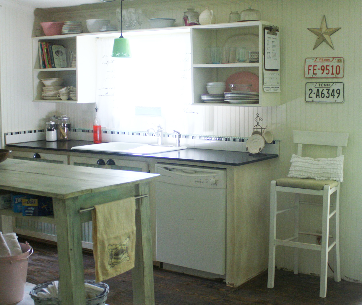
If you’ve ever wondered why my blog is called “shabby” anything – this is why. Our first remodeling efforts showed a lot of shabby and very little chic. Look up above that spray painted pink chandy. See that line on the wall? Shoddy work. We had no idea what we were doing! But, the more we progressed in other rooms, the more we learned.
Enough of the before…. wanna see the afters???
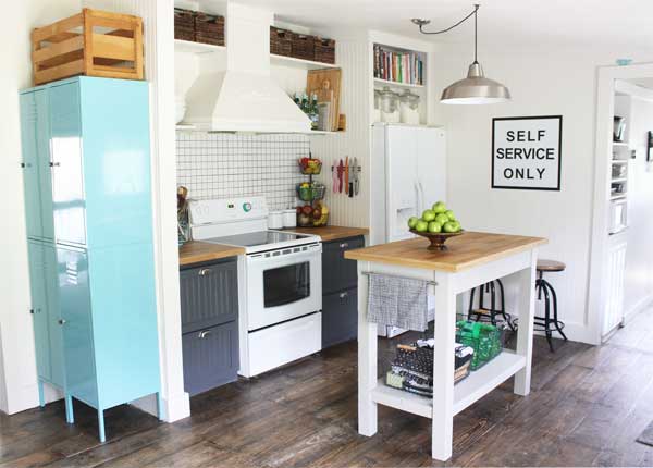
This is our kitchen now. And it’s totally us. We started with a slightly brighter wall color from the new HGTV HOME™ by Sherwin-Williams Softer Side Color Palette. I was so excited when they asked us to join this campaign, because softer side is right up my alley. There were some gorgeous choices – and I’m going to share more on that next week. All of the paint in my kitchen is HGTV HOME™ by Sherwin-Williams Interior Paint from the Softer Side Palette, on the walls is Porcelain, on the cabinets is Peppercorn, and on the island is Requisite Gray. I kinda love the combo! It’s bright and airy – yet the dark gray grounds the cabinets nicely.
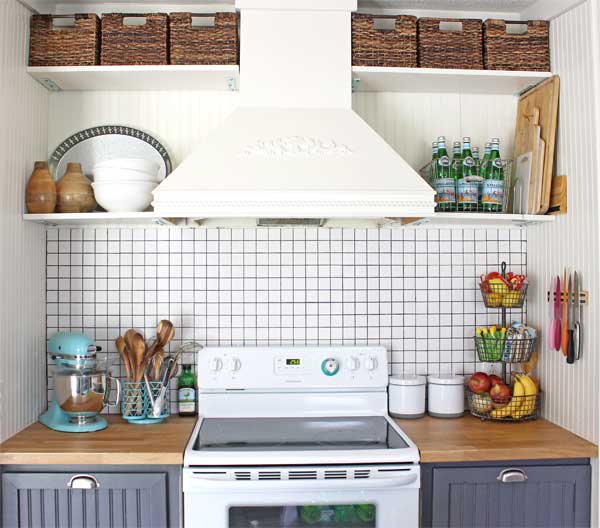
I always felt like the area above the range hood (that Mr. SCC hand built during our original remodel) was a little empty. I struggled for years to try to fill it, honestly just giving up somewhere along the way. After we built the wall beside of the refrigerator, it made it easier to add in shelves and have it all be symmetrical. {Symmetry is an OCD girl’s best friend.}
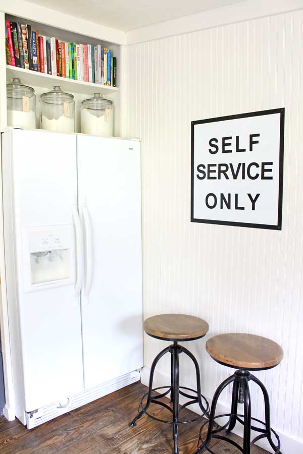
Above the fridge, we took a clearance set of cabinets with banged up doors, removed the doors and incorporated them into the design. Don’t ask me how he did it – honestly I have no idea. I went shopping one day, came home and it was done. He would never cut it as a blogger, yo!
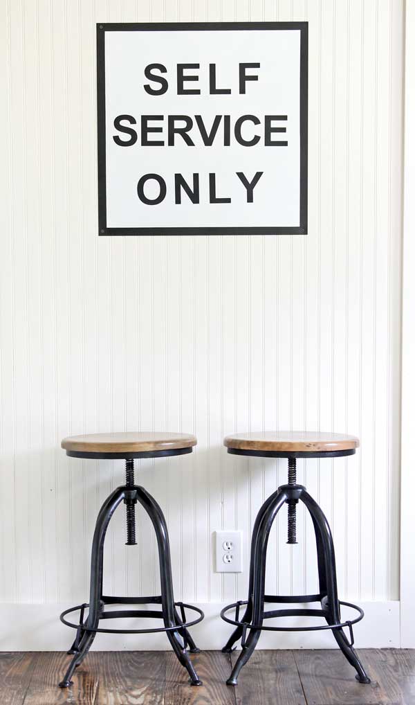
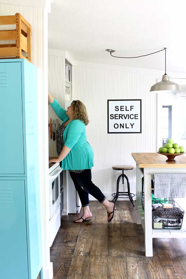
Of course, there was a LOT of DIY that went on in the kitchen – including my Self Service Only sign. And the adjustable barstools are perfect for the space, especially since no one could figure out whether we wanted short or tall stools. Don’t ya love simple solutions to life’s big dilemmas?
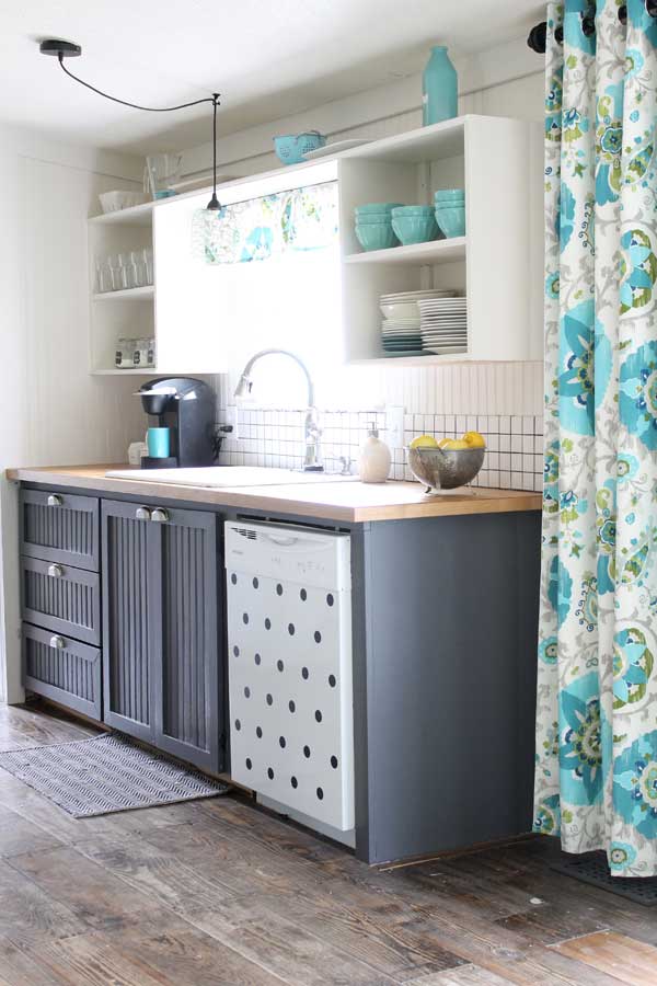
Around the sink stayed virtually the same, except for a new backsplash and my easy valance. My polka dot dishwasher looks a lot better now – it doesn’t stand out as one of the quirkier bits in a boring kitchen.
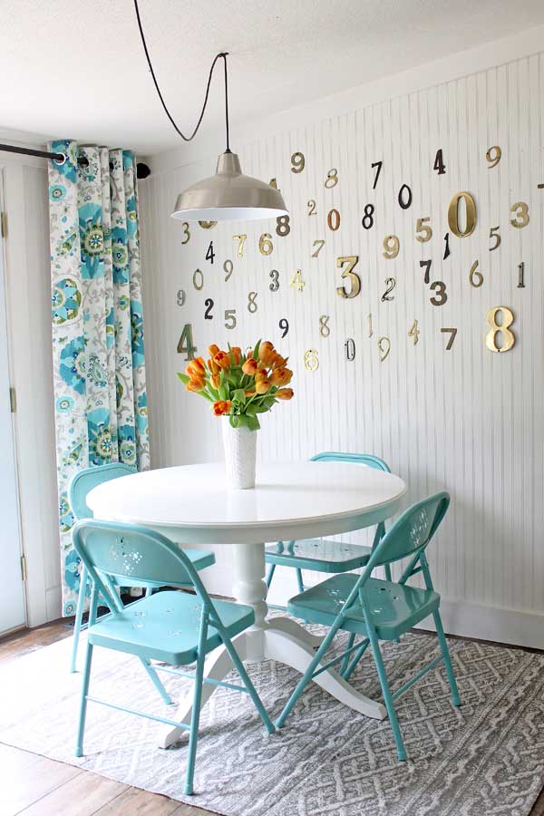
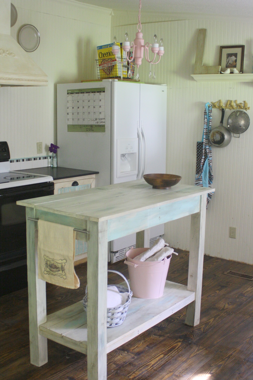
My eat in area barely changed at all – just a few more numbers on the wall and a new table. Well, plus the beautiful paint…. that was the real show stopper of this area. I love how it looks so much better by really only freshening up the paint on the walls.
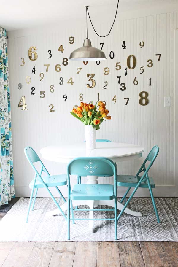
Can I just say, I’m loving the cheap folding chairs? What you can’t see is two more tucked behind each of the curtains by the French doors. The table opens out to seat 8 comfortably, and it’s such a blessing for big family dinners!
 And that’s my kitchen makeover! I still have a few more projects to share, but I couldn’t wait any more to share it. Now… who wants to come over for lunch?
*Thanks to Sherwin-Williams™ for partnering with me on this post. All ideas, photos, opinions and ideas are 100% my own.*

I’m getting ready to redo my soon to be 8 year old daughters room and love the combo of porcelain and ask violet! She loves purple, and I don’t….ash violet seems like the perfect compromise!
What a great make over and you all did it? That’s amazing! Oh, it’s chic now, no doubt about it!
I really love Breaktime and Aloe and I would paint my guest bedroom or my living room this color to brighten them up.
I love porcelain and would use ir in my bedroom.
My 72 year old husband and I (61 years old) have recently been blessed by having a 13 year old teenage girl move in with us. I have been making our spare room all hers and also making a sitting and dressing area for her…for those times she needs a break from us. She s all girl and Charming Pink is the color she has picked out for her room and Breaktime for her sitting room.
Holly Anne, that sounds absolutely amazing of you! The way you describe the situation shows how much of a caring person you must be. I just wanted to drop a little note to say that you sound like a wonderful person! (P.S. the colours she picked out look adorable!)
Loving the new HGTV Softer Side paint colors. Like you, I too like the Porcelain and would love to redo my living room with this new color. Thanks for the chance to win and refresh a room in our homes!
I really love how it all came out and the colors are stunning. 🙂 I like that Watery color and of course any form of white. 🙂 Thanks for sharing with us today.
Note: May 9th my blogs URL will be changing to: http://www.msmoozy.com
I like the realist beige!
Your kitchen looks great! I love so many of those colors, I think Thistle is my favorite, although I don’t think I’d be able to use it on my walls 🙂 Requisite Gray and Realist Beige are jumping out at me for my living room/kitchen area which I will be painting soon. Could REALLY use the free paint, as I’ve been planning to use Sherwin Williams paint for this project after hearing from you (and others) about how much you love it!!
The kitchen is FABULOUS!!!!! Love everything especially the awesome tile and black grout! But that number wall steals my heart each and every time! : ) hugs…
I love the Aloe, Breaktime, Requisite Gray, Peppercorn and Black Magic! My choice of colors in my house are very similar to yours – black, aqua, and shades of whites and browns. I would paint my kitchen cabinets with the Black Magic – first…….I would then paint the legs of my kitchen table with the Peppercorn.
Mellow Coral, but Watery is a close second. I love the changes you made in the kitchen. The cabinetry around the refrigerator and the shelves over the stove are a great idea. Helps to make the kitchen look so custom. Great job!
Requisite gray for my nursery..or maybe Watery
I love the Watery color. Need to redo our master bedroom and that is such a relaxing color. Fingers crossed!!!!
I would paint upper cabinets porceline and my bottom cabinets the beige color. Those are some beautiful colors. Your kitchen is awsome I love how you decorated it >)
Hi, Gina! The Sherwin-Williams “Ash Violet SW6549” is just the “grown-up lavender” shade that I have been looking for in the Master Bedroom. Is it purple, is it gray? No, it’s JUST RIGHT! Having been oldly-weds for 4 years, we haven’t had an opportunity until now to make our own Master retreat that reflects US! (We took in my Mom for 3 years, until she passed after some strokes. We gave her the Master bedroom then, with fresh REALLY PURPLE paint, per her request!) I’ve been a “black & white” fan for the last ten years, so Ash Violet walls would make my black & white accessories & bedding look terrific! And honestly, guess I’d have to try one wall in “Peppercorn SW7674” as an accent. That’s a bold move for me, but after turning 60, I’m going to live the last third of my life to the fullest & try new things! The new HGTV Softer Side color palette is beautiful: can’t wait to try any of those colors! Thanks for sharing, LOVE your “new again” Kitchen.
I’m prepping to paint my kitchen AND I love watery and porcelain
Love breaktime. I’d love to use it in our master bath and bedroom suite
I love your kitchen. The paint colors are beautiful. I’d paint my kitchen porcelain. Thank you for the wonderful giveaway.
I am loving porcelain and would paint my kitchen.
I would like to paint my bedroom…time for a redo…probably Porcelain. Love all the colors…
Haven is the color for me. Seems like a great neutral. Great give away! Thanks.
We are doing our upstairs over and I am finally getting my craft room!!! I pick Jonquil for my room and porcelain for the other room.
The walls in my bedroom are too dark for my taste. I might try the Realist Beige in there to lighten things up. Your kitchen looks great!
Watery for sure. Though I do love me some yellows. And my younger boys room needs repairing something fierce.
I would repaint my bathroom Haven. I tried to paint it a few years ago but it turned out mint green…wasn’t going for that!
Thanks for the opportunity! 🙂
We’re planning a makeover on our bedroom. I really really like Requisite Gray for the walls..
wow i love the colors…butter up, watery, porcelain, requisite gray, realistic beige….i want to paint my living room, dining room and hallway…
I LOVE Break Time! I am needing (desperately) to paint my office/craft room. It is currently wood paneling.
So many pretty choices! I think I would have to go with ‘watery’ in the master bathroom!
I am loving the corals with lavender this Spring. I would love to do the Mellow Coral on my girls’ bedroom walls to go with their lavender bedding and add accents of orchid and bright coral!
Wow! Absolutely love your kitchen. I liked it before but now it is fabulous! I would love to come for lunch. 🙂 You did a great job. I do love the new HGTV Porcelain paint color. My whole house could use a refresh.
I want to paint our kitchen next. I think Porcelain is a nice color.
I love Breaktime. I have been looking for a color like that for my guest bathroom.
beautiful kitchen. I especially love the polka dot dish washer.
I love the simplicity of the redo plus the bright pops of color… when I look at all my pins Turquoise shades are my fav
I love the Breaktime color & I would use it & Balanced Beige in my Master Bedroom/Bath… it would perfectly match my comforter/decor and I haven’t painted it since I bought the house so it boring builder beige
Lovely colors and lovely, home-y space. Very comfortable.
Would love to win the paint for a kitchen refresh of my own. . . 🙂
Porcelain!!! My daughter is leaving for college and I am going to surprise her by re doing her room.
Watery for sure! Would love to paint my bathroom that color!!!
Your kitchen looks great! I love the pops of turquoise (especially those bowls on the shelf…where are those from?)
I love “watery”!
Oooh I like break time and I really want to paint my living room. Your kitchen looks fabulous and I love your chairs.
What a great make over!! I would pick Realist Beige SW6078 for my hallway. It’s in need of some freshening. Thanks!
I like Peppercorn the most, for our Master Bedroom. But I also like Lei Flower for a little girls room or a nice pop on a piece of furniture 🙂
I absolutely love everything in your new kitchen (including the “new” you)! Super fab job! In the pics Porcelain looks totally white, but not as much in the swatch sample. I’m in love with Breaktime; it reminds me of the beach, soothing waves and relaxation. My whole house is stuck in the 90’s old world feel and I am slowly moving in a more lighter, brighter feel. I would start with the kitchen! I just bought my first can of Sherwin Williams last week for doors and trim, it works great!
I love the colors Thistle and Memorable Rose. Both colors are beautiful and and now that I am divorced I can paint rooms in the colors that I like!!!!
Gina, I love your kitchen make-over and you look fabulous! I like the paint color Butter Up. If I win, I’ll use it to paint my mud room. 🙂
I love your kitchenI My daughter has a pink room but I would repaint it Porcelein or another neutral color so she can keep redecorating without repainting every six months! My bedroom needs an update to a pale blue (waterly) and both bathroom need new colors. 5 gallons would go far in my small house.
Your kitchen makeover is wonderful, well done! It’s so fresh, bright, cheery and open. Love the pop of turquoise! I’d love to come for lunch. Where did you find your kitchen stools, perhaps Ikea?
The new HGTV softerer sides colors at SW are perfect. I would start by painting my office with Butter Up!
all the colors are great…..i would use the watery to paint our living/dining areas…..we are in need of a redo….and lt. blue is on my wish list!
i would love for you to be my new best friend and help me redo our kitchen!!! 🙂
yours is amazing……i love everything you chose!
I love the Breaktime and have a bedroom in mind, but that much paint? Hmm or I would take the Porcelain and the Requisite Grey An do the lower level or our new(to us) home. The former owner had a love affair with mint green, which I am slowly make disappear.
Youngest daughter just graduated from college and it is time to tackle the house that I have been ignoring for some time. I love Sherwin Williams paint, used another brand for my craft room and am not happy with the results. Although my biggest project will be replacing the flooring throughout, I am making a list of the walls to repaint. I love that Aloe for the bathroom. I may go with watery in the living room/entry. My dining room is visible and may need a contrast color but I am not sure where to go with that. Then there is the kitchen which is also visable to the living/dining area. I love to look at Sherwin Williams cards to have a choice of coordinating colors already picked out to choose from. As you can see, I have lots to do, so 5 gallons would be a wonderful start–thanks for the opportunity.
I really like Requisite Gray. It would be perfect for my boys room that I have been wanting to repaint.
I would pick the requisite gray for my kitchen!
Everything looks so pretty Gina! I know what you mean, sometimes you have to quiet all the voices and just listen to yours. The new colors are so pretty in your space, it all just blends beautifully. I really like what you put together. It’s a gorgeous, soft palette. I like both the hearts of palm and the haven. And pretty much all the others too.
ohhh how I love this color palette! I my hallway is in desperate need of a fresh coat of paint for my new photo gallery coming soon. REalist beige would be perfect!!!
blessings,
Shan
The How to Guru
I love the lei flower for my living room wall!
Looks fantastic Gina! I love the color you chose for your cabinets.
what an amazing makeover. We are in the process of re-doing the great room and I love the porcelain and honest blue.
Our family room is paneled and desperately needs a makeover. I would choose porcelain…and possibly some details in break time , mellow coral, or requisite gray.
Gina I LOVE it!! I love how bright and fresh the space looks! What color did you use on the walls? I’m looking for a nice color like that for one of our bathrooms!
yeah – it’s MUCH lighter in real life than it was on the swatch. Maybe that’s because the space is pretty well lit? I don’t know, but I do know it’s a great color!
Hearts of Palm or Breaktime – hard decision
I love the ash violet! Would look lovely in our bedroom. So many great colors!
I think Breaktime would be perfect for the look I want in our bathroom for when we are ready to remodel. Right now I have mustard yellow tiles from floor to ceiling in there (along with a mustard yellow tub and surround) and I can’t wait to bash them off the walls and replace everything to a nice calming spa like atmosphere! Love what you did to your kitchen especially the cabinet above your fridge.
Love your kitchen Gina! Those are my colors, too, so it feels like home.
My favorite is Requisite Gray. I have been wanting to paint the first floor of my sister’s house and this is the color.
I also need to paint my kitchen! 🙂 Your kitchen looks great in pictures and in person! 🙂 I would go with breaktime in my kitchen!
Peppercorn in my living room!
Well, I adore the Thistle, but I’d do Balanced Beige in our upstairs hallway – which is still icky flat white contractor paint!
Love, love the Requisite Gray
my sunroom! it’s a toss up between; watery, breatktime & honest blue? I’d have to get some test quarts of course . . . . if i have to choose now I will go with breaktime . . .
lovin’ the colors of your kitchen – and your floors!!
xo ellie
I love your makeover!!!!
Break room is my favorite color. I’d paint my bathroom
I love Watery. I’d love to redo my living room in this color. Of course, then I’d need all new furniture also.
My five year old daughter is geeking out over Memorable Rose right now! We’re moving into our new house mid-June and she’s been day-dreaming about decorating it (me too :). Maybe with some large graphic floral stenciling?
Nice work on your kitchen! I have a kitchen reno to plan as well.
Nice kitchen update! I love the attention to detail but that at the same time it’s not over done.
I have been pondering a revamp on our bedroom, and something like break time blue on the walls with yellow & white furniture is the direction I’m headed. Love the fresh and happy spring colors!
LOVING the Peppercorn! I’d do the same treatment in my kitchen; dark grey lowers with white/off white uppers. Kinda trendy, I know, but I don’t care! Anything has got to be better than the 1986 oak cabinets!
Will paint our dd room in a shade of mauve..:)
I am slowly changing my color scheme and would love to paint my two story foyer. I would probably choose Porcelain or Realist Beige.
Requisite Gray! Like the redo!
Breaktime makes me smile!
Your kitchen looks fabulous! I have some hallways and a powder room in desperate need of painting. I love the Porcelain color.
Oops…I’d paint my bathroom in “Breaktime”!
I love the Requisite Gray.
Hi Gina,
I love the kitchen update. The colors are wonderful and similar to what my kitchen has. Where did you find the turquoise bowls? I love the color Breaktime, I would put it in my Master bed room. With lots of clean soft white accents
Hi Hollea, They’re from Anthropologie (I love those bowls!!)
My initial choice was haven… It’s a beautiful green and my favorite shade of my favorite color, but I think I would paint my bedroom with mellow coral.
I love the Porcelain and Watery combination.
Gina! This is stunning! Oh my gosh…. I want every square inch of this kitchen! Bright, cheerful, wonderful! Totally win!
Our oldest recently left the nest and I’m gearing up to convert his room to a guest/craft space. Love the Mellow Coral!
I love kitchen redo! Very nice job! I really like the whole palette of colors from the HGTV HOME™ by Sherwin-Williams Softer Side Color Palette! I can see using several colors in my home! I would definitely use the porcelain, peppercorn and requisite gray in my kitchen, accented with all my red dishware and black appliances. I would use the porcelain and watery in one of my bedrooms also! So if I had to pick 5 gallons of one color, I would say the porcelain! That way I could use it in several rooms! Thank you for the opportunity to enter the drawing! Love your blog and the inspiration that it gives me!!
Peppercorn!!!! :))
Gina,
I love how you stayed true to yourself. Your teal color pops up everywhere and that is awesome! It seems like your kitchen really works for you now. Great job and thanks for sharing it with us! I feel the same way about green as you do about teal! So if I had to pick on of the new HGVT softer colors it would be Haven. It is the perfect softened up green for any area of the home.
Peppercorn for the library! Sultry and sophisticated with lots of rich leather. Love your kitchen makeover – especially the built in around the refrigerator. I am planning to do the same in my kitchen and love the way yours turned out.
Love the remodeled, remodeled kitchen!! 🙂 All of your hardwork really shows.
I am getting ready to redo my son’s bathroom (and I’m a little skerred!!) but the Peppercorn, Requisite Grey and not sure which other one to go with. Thank you for the opportunity!
Breaktime for bedroom and bathroom. I also love porcelin for my kitchen cabinets that we will be painting soon
Hi Gina, after redoing my master bedroom in a soft grey I’m hooked. I love the way it turned out. I’ve been thinking about doing my living room in a grey also. I would love to try the realist beige or porcelain in the living room. Thanks for the giveaway! Your kitchen looks great!
I love your makeover! I think my favorite color for my makeover will be Butter Up or Hearts of Palm. Thank you, for the inspiration!
The porcelain is my favorite color and I would paint my computer room.
I love the aloe and requiste gray! Would look great in my master bath….
Love Peppercorn! It would look great in my master bedroom.
The ASH VIOLET is beautiful! Your kitchen looks very inviting. I think the polka dot dishwasher is cute!
I have been wanting to paint my master bathroom for quite awhile now. Breaktime would be the perfect color!
I love the butterup! Perfect for the outside of my home!!
I would love Requisite Grey for the great room. It definitely needs a bit of color instead of all that white!
Ohhh yea ash!!! Porcelain would be great in my grandsons living room. His Mom painted it a dark dark brown. HELP!! It dark and dank like a tOMB! But I have to say that the lady that has a thirteen year old living with her now should be the winner.
I believe gray background makes beautiful colors pop. I want porcelain for my kitchen walls to show off my vintage dishes collection on the shelves.
Oh my gosh – I am in LOVE! I always complain about our tiny kitchen (our house is less than 1000 square feet) but if mine looked like yours I would never complain again! I adore every inch of it! (And I even have those same cute aqua blue folding chairs from Target – love them!) Amazing job!
Thank you for the chance to win! Breaktime is awesome! What a cheerful color. I would use it in my family room, to add some playfulness.
Ha – I got so excited about your kitchen I forgot to mention my favorite paint color. I love the Breaktime color! It would fit right in around my place. 🙂
Aloe… for my daughters room.
Beautiful makeover! Our kitchen is in need of a makeover also, and I think Butter Up would be beautiful in it.
I love Black Magic and would use it on the beadboard in my bathroom.
Hearts of Palm to replace the avocado in my kitchen, to lighten and brighten…
Cute as ever kitchen, I always love looking around!
I love your kitchen!! thanks for sharing!! I would love to repaint the main room of our basement (my current childcare) either porcelain or realist beige (so that it won’t need redone in 3 years when we are ready to put it on the market + it will work nicely for an update for us now)
I would love to brighten our laundry room and also put an accent wall in our bathroom. I think the Aloe color would be very soothing for both areas.
I LOVE your new kitchen. The swaged lights are ingenious! It is a huge vote for Porcelain colored paint but I love the Peppercorn as well.
I love the butter up. We have been in our home for 3 years now and I think it is high time the master bedroom got a new paint job!
I love either watery or charming pink for the nursery (once we figure out what flavor we are having!)
Your kitchen came out beautifully! An inspiration 🙂
I would use Porcelain in my great room which includes our living room and kitchen and is open to the dining room and entry. This beautifully neutral color will tie everything together and let me decorate with whatever colors I want, seasonally or when the mood strikes to change something! I paint furniture (and anything else I can get my hands on) and things change often!
I lover the peppercorn. I would dou like you and paint my lower kitchen cabinets.
I just bought a new home that needs to be completely painted! I would love to use Watery for our bedroom, Ash Gray for our son’s room (yes he wants purple), Jonquil for the Kitchen – so cheery and Requisite Gray for the living/dining rooms. Nice choices. Ohh and maybe a wall of Lei Flower in the Guest bedroom. I love color and cannot be a person to pick different shades of one color, my husband and I met in Art School.
I love the Haven! I would love to paint this color in our laundry room! 🙂
Requisite beige!
That kitchen is gorgeous!! I am inspired!!! I have been wanting to fix up the front bedroom and make it into a meditation/office/craft room. I think Aloe or Balanced Beige would be perfect in there!
Your kitchen looks fabulous girl! And I mean it. Fabulous! Love the change of style. I don’t know what that “style” is but its very close to mine. I also went from vintage to a cleaner…contemporary cottage/farmhouse/polished casual? look with just a touch of vintage….
Here’s my deal Gina….you give me the 5 gallons in Requisite Grey and I will paint my dining room below the chair rail and my living room (they are open like one big room) and then I will pay you to make my grommet curtains in the same gorgeous fabric you have! And if ya think I’m kidding…I’m seriously not! I want those curtains! I have to share this on my blog if that’s ok??????????
Do I really have to choose just one? All the colors are perfect and I could find room in my house for all of them, lol. Watery would go great in my beach themed office/craft room/mom cave. Charming Pink is exactly the right color for out playroom turned teenage lounge. I’m torn between Aloe and Breaktime for the guest bath. I think my kitchen would have to be done in Butter Up. If I had to choose though, the Charming Pink is my favorite, plus the lounge is the room currently working on.Thanks for sharing!!
Gorgeous! Jonquil is mt favorite.
I think that the Balanced Beige would look great in my kitchen!
love the requisite gray!
Oh….such a hard decision to make! I love the Requisite Grey the best and I would paint my dining room/living room with it! Aloe is beautiful too as are all the colors…:) I so need to win this giveaway….:) Perfect timing for my upcoming summer remodel plans!
Blessings, Vicky
I am preparing to paint and decorate my bonus room for a guest room and would love to use Requisite Grey! A perfect neutral color to use with a lot of bright pops of color!
I want to come over for lunch!! I love your kitchen, Gina! I think I’ve seen it every way you’ve had it since that first makeover 5 years ago. I think it’s awesome the way you’ve turned this room into such a custom space. I’m glad to see your signature aqua in this room!
I would love this! I have time off work in June and am going to paint my living room, dining room, hallway and Master Bedroom, plus trim and ceilings. Big project especially since I don’t like to paint! I’d choose porcelain as it looks to be a pretty neutral color!
I love the requisite gray and would use it to paint our kitchen and the back of my bookcases in my family room.
Watery. It is so beautiful. The perfect blue!!
I love love love the Watery
Your kitchen looks amazing! I love, love your style! Good for you for finding your own style in an over-opinionated world! I find myself getting so overwhelmed and confused in the world of design/decorating cuz I love so many different things! 🙂
I love Requisite Gray and Porcelain!
Love the update! I desperately need to paint my entire first floor so 5 gallons would probably do the living room and dining room. They are adjacent so I think Porcelain SW0053 would be a really good choice for me. Thanks for the opportunity!!
I love the SW 7023 Requisite Gray for my livingroom. I picked out a grey 3 years ago but it ended up looking like a blue and have been wanting to repaint it since. Thanks for the chance!
Our guest room needs repainting and I have been looking for a soft but real yellow. I think the Butter Up would be the solution. We live on a lake and are surrounded by a lot of trees, so even though the exposure is southeast the room is not bright. I have wanted something to warm it up that wouldn’t shout yellow. Thanks for the idea.
I adore Porcelain and I’d go to town with it painting my family/play room!!!
My daughter would love her bedroom painted Breaktime. So beautiful and cool looking.
Carol L
Love you kitchen! And what a great giveaway! Requisite Grey looks perfect for my living room which needs an update badly, and Watery is perfect for the guest room. Thanks for a chance to win!
Love, love AND love times a million!! It looks awesome!
I’d paint my kitchen in break time and our master bath in watery.
I would have to say in only picking one it would be Butter Up. I love the color Yellow in a house. I was just telling my husband last night that we need to bring some color into our very dark livingroom. I am used to having bright colors in my house such as the blues you have in your kitchen. I was actually looking for different things to incorporate that was exactly that color blue you have into my livingroom. That is my project this summer is to make the house more airy and fun looking.
You did a great job on the kitchen redo…I absolutely love your style and it gives me alot of motivation. Can’t wait to see your next project.
I would use Aloe on my laundry room. Then Watery on my soon to be started living room makeover 🙂
Erica
http://www.fortheloveofdecorating.com
Love the Peppercorn. You have it in your kitchen and The Nester has it in her master bedroom, so it has got to be cool, right? Also, love the Requisite Grey and Watery.
Everything looks great – you guys did a wonderful job!
Well, since I live in a Lavender House, I’ll have to say those two lavender colors are my favs! Since I’m more a clear color kind of gal, I like the Thistle better than the Ash one though!
Enjoy your “new” and improved space!
gena
Breaktime is my favorite! They all look great though! Great job on the kitchen…it looks fabulous 🙂
I would love to paint the master bedroom with honest blue…think this might be a great surprise for the wifey come Mother’s Day!
Just found your blog today via Instagram. I really like the look and feel of your kitchen makeover. Love those stools. And the grey on the cupboards.
http://llibbyslifestyle.blogspot.com.au
I would try the hearts of palm for the family room. Love the soft colors.
I would love to repaint my sons room Requisite Gray.
Your kitchen is gorgeous! I love all the changes you made.
Love peppercorn! Perfect dark, sexy grey without being soul-sucking dark!
I would do the peppercorn and ash violet for a sexy master bedroom redo
Watery for my bedroom or basement or porcelain
Requisite grey for the kitchen (I think!). Your kitchen looks great…love the eating area.
I love the peppercorn. Thanks for the chance!
I think Thistle would be great in my living room & craft room..Love your new kitchen!
Loving the porcelain! unless my display is screwy it appears to be a soft gray! love the cabinet color
Butter Up!!!!! Absolutely perfect for my guest room/granddaughter’s sleepover room!!!! So fresh and fun!!!
Hi Gina, the porcelain is my fav and would look fab in my dining/living room
SW7023…my living room and dining room both need to be painted, but as a renter, I hate to spend the money updating a place I won’t be in for long. But I am in need of some paint therapy…help me out ! =]
Honest Blue. I would like to tie our bathrooms together with this color.
My master bedroom hasn’t seen an update in 13 yrs, would love to use Requisite gray and then be able to accent w/ Mellow coral.
Love the requisite grey and black magic for my bathroom I want to redo
I would love to paint our master bedroom with SW 6415
Hearts Of Palm. It would be lovely to wake up to such a soothing yet cheerful color!
Ah love too many!! But aloe.. Ash violet.. Water.. Break time.. Mellow coral… I am.wanting to repaint bedrooms and bathrooms
I am building a kitchen island. Weren’t and everything is neutral. After looking at your post and the paint colors, I am thinking Peppercorn for the bottom (just bought an old kitchen cabinet this morn to help with that), and Mellow Coral for the top. Probably not everyone’s taste, but when looking at the color samples, it just seems right!
Your kitchen looks so beautiful!!! You did a fantastic job!! I love the color Porcelain! I would use it for my living room and kitchen. Thanks for all the inspiration!!!
Your kitchen looks incredible! It’s so bright and airy and cheerful! My favorite color from the collection would have to be Jonquil. I’m a sucker for a happy yellow 🙂 I’d use the color in our dining room to really add a pop of color.
I love the SW 7023 Requisite Gray, I think it would go into our office
I love the whole pallet. I will be an “empty Nester ” soon. My plan is to make one of the bedrooms into a space for my grandchildren. I would use Memorable Rose as the pop color. The Breaktime would be my main color and the Peppercorn would be for small accents such as sign lettering, maybe an arrow made from wood.
I think this combo would solve the problem of a room for boys and girls, because I have both. I would find a few pillows with all three colors present. I would make a canvas floor mat of arrows using the colors to some degree.
I would make a “loose” mural on the wall (I must as an artist). Probably a peppercorn silhouette of a tree with rain drop shaped leaves in random using both of the other colors.
That was fun. Thank you.
I love the unexpected touches in your kitchen-like those lively polka dots and curtains. The dark floors set everything off. I love that you use more than one paint color too.
I like “Watery.” I would start by painting my kitchen cabinets with it. I would like to redo most of my house in a beachy theme, so “Watery” would be perfect.
http://cottageinstincts.blogspot.com/2013_10_01_archive.html —She did her cabinets in “Watery”
I love the Ash Violet. SO pretty.
I love your new makeover, thanks so much for sharing! I am thinking Breaktime or Watery would be perfect for our master bedroom! Nice and calming.
I have to say I love Aloe . Very pretty color!!!
Love, love, LOVE the Bracing Blue and I’d use it to paint my entire Living Room. it’s GORGEOUS!
Sorry I meant HONEST blue not Bracing…I was on wrong color palette 🙂
I know it’s rather dark, but I like the Peppercorn. It would look amazing in my dinging room and living room area.
They’re all so pretty it’s hard to pick one but I would start with watery in the master bathroom.
I love the Watery and think it would look great in my bathroom! Its in need of a change from dark to light.
My favorite is Haven to use in the kitchen
Love the Watery. Very serene color for a bedroom….
Prior to moving into our home 10 years ago, the colors that I chose we’re totally wrong with the sun exposure – dark colors in the rooms that do not get any sun whatever! I’d choose to paint the dinning &/or living room in Butter Up or Jonquil! Fingers crossed, happy for the chance to brighten-up our “cave-like-rooms”!
Ash Violet….our bedroom! We are having a quilt made in Goshen, IN….should be ready this summer, we have been paying monthly for it for 2 years!! We do a road trip from NY state to pick it up…. Zowwwweeeeee!! Can’t wait to repaint and redo our bedroom!!
Really like what you’ve done, especially the Peppercorn, -would not have thought that dark of a color could be pulled off in the kitchen, thanks for sharing!
-WHERE did you get the stools? LOVE THEM!
I really need to paint the Master bedroom and BOTH upstairs bathrooms, I am liking the Porcelain and Haven colors, and maybe even the Aloe.
Hey Robin, They came from Homegoods – love that place!
Your kitchen turned out so nice! I love Sherwin Williams’ Peppercorn color.
Your kitchen looks fabulous!! Love the darker bottom cabinets with light uppers. They really ground the space. I’m digging your lockers! Love that they are your signature color 🙂
The Requisite Gray is right up my alley. I want to repaint my living room and I’ve been looking for the right gray (who knew it could be so hard)
I would love to paint my kitchen in hearts of palm
Watery….my eye went to that color first. I would paint our master bath.
Your kitchen makeover is awesome. Love it. I hope you share where you found the lockers. Love the color. Looks great.
My favorite color is Thistle and I want to paint my living room
This would be an absolute dream to win! My sweet mister is getting ready to list his grandparent’s home and I would love to surprise him with new paint. I would choose Realist Beige to cover the 1970s paneling in the living room, hallway, and kitchen. Thank you so much for the chance!
I love the Thistle. I am not normally a purple person but that is a gorgeous purple. Sadly we are getting ready to paint every room in our house because, not so sadly, we are putting our house on the market so this would be a huge blessing to us!
Watery for my bedroom
Haven for my kitchen and dining room and Aloe in the bedroom 🙂 Love your kitchen, the cabinets above the refrigerator are a great idea.
SW 6464 Aloe. I am in love with the soft blue/turquoise. I would use it to make colors pop in my kitchen, maybe around the rest of the house, too! We are looking to turn our light oak cabinets into a pop of white cabinets this summer, and my husband already changed the layout in our pantry to be more efficient for us. I can’t wait until it is finished!
I love the requisite gray, and would use it in my kitchen!
Oh my gosh I love them esp the blue green and lt beige ones oh and the yellow , I would paint my bedroom the porcelain my walk in closet the butter color and my laundry room the break time . This is a very hard choice. Gina your kitchen is awesome it has really evolved isn’t it interesting how that happens?
Would use watery in my bedroom……looks so calming!
Peppercorn would be a great accent for the back of my built-in shelves in my mid-century modern living rtoom. Love the kitchen. Very inspiring!
Watery and porcelain for my laundry room makeover please! gorgeous…
I am drooling over that charming pink. I would paint my sewing room in that lovely color.
I love both Aloe and/or Butter Up !!
Watery in our basement school room. It’s so beautiful!
I love the color Breaktime. Soft and cool! I would use it in my bedroom which is in desperate need of a do over with paint!
Lovely kitchen, so fresh and inviting! I’m a teacher and will soon be off for the summer ready to paint my bed & bath…I think watery would be perfect:). Thanks!
Summer project- finally paint my fireplace white.
Wouldn’t it look great against an Honest Blue wall???
I do miss the pink chandy in your kitchen….
but love your curtains and your chairs and
the fact that you make swagging cool light
fixtures look great!!!! Your sign should be
a must in every busy kitchen!!!! Don’t we all wish
we had your talent ??
Very pretty. Where did you get your table? I need a table that can expand to seat 8. Thanks.
It came from Ikea 🙂
Haven !!!!!!!!!! Kitchen Area …TY
About to start renovating a 100 year old farmhouse and Butter Up may be the yellow for my front door. Thank you for such a great giveaway!
I love the jonquil. I need to repaint my living room and hallway. They connect and will get the same color.
Your kitchen turned out fabulous! Love the shabbiness!! Turquoise/blues are so soothing.
I would paint my living room in Butter Up
My dream shed is almost done! Porcelain would be perfect for the interior with watery accents.
I love the aloe. It would be a great accent in my living room.
Discovered your blog via pinterest re: your fresh looking kitchen. A redesign truly well done. I have you bookmarked now and will definitely be returning often. Am in the midst of redoing our family room, so while 5 gallons would be overkill I’ve had a Sherwin-Williams fan deck on my desk and Balanced Beige SW 7037 has been in the running for the last 2 weeks.
Hearts of palm or Realist Beige for my living room. Love your kitchen!
I would love to do our bedroom in Breaktime! It needs a nice, soothing color.
I’m thinking the Butter Up for my kitchen! Love your kitchen!
Breaktime! What a pretty blue! I’m debating on whether I would use it in the bedroom or the kitchen, but either space would be beautiful!
You are amazing! I love love love your blog.
Breaktime is so pretty. I think I’d like to put it in my pantry.
Can’t wait to see the other projects.
LOVE the kitchen – I haven’t started my kitchen makeover yet and you’ve got lots of great ideas here.
I’d choose the peppercorn for my own kitchen. I’m planning a white bead board wall about 5 feet with the dark gray/black above. It will go nicely with my gray dining room.
My second choice would be the Hearts of Palm for my boys’ bathroom and third, Balanced Beige for the master bedroom.
Time to get out my paintbrushes regardless of whether or not I win – I’ve got lots to do!
Breaktime an I would paint my bathroom.
Love everything you do!!!!!! I would used Balanced Beige in my living room and hallway.
I absolutely adore Watery. I finished a wall in my kitchen with 8 layers of different colors of plaster- the colors in my Italian ceramics. Each layer brings a hint of color and the final layer tied it all together with a gold hued clear protective glaze. I love it so much but have been seeking the right color to paint the rest of the walls. I can not believe how perfect Watery will be. I went on the Sherman Williams website and found the color card of mixed soft colors. I think Porcelain will be the living room choice since it is open concept and the two colors will look so great next to each other. I can not thank you enough for your blog and bringing these colors to my attention. Your kitchen is inspiring and it was great to read about your failures and successes. Makes it easier to dive in and have fun knowing it can all be changed – again…..Thank you.
I’m thinking realist beige for my bathroom! Fingers crossed I win the paint.
I had to smile at the last pic…I know you know Edie and you are channeling her perfectly from her turquoise kitchen. I’m assuming you meant to do that
Oh my gosh – I am! I didn’t even realize it, but her old kitchen is one of my faves of all time. Love her!
Living room. Requisite Gray. Awesome post and love the afters.
Requisite Gray. Living Room and hallway…loved the post.
I love the color Watery and would paint my kids’ playroom with it!
I honestly love Honest Blue! We are getting things together to fix up my daughter’s room. She wants blue walls with turquoise and bright pink. I am so excited!
I really love the new fresh look of your kitchen! My favorite is the numbers in the dining room, so creative! Right now we are almost to the painting stage for a new bedroom for my son. I really like the Requisite Gray.
I love your kitchen remodel! I would redo my bedroom in Haven. Seems like the perfect color for a retreat.
I love breaktime! I would use it in my kitchen to match my new jadeite collection!
I would love to paint our bathroom Watery or Aloe. So many beautiful colors it is hard to choose. I Could pick a color for every room.
I would paint my cabinets Peppercorn just like you did. Love the whole kitchen, but your cabinets make me swoon!
I love the requisite gray 🙂 great for every room!!
Breaktime is a beautiful hue. It looks like it’s the perfect watery blue-green color that I love. I need to paint both of my bathrooms this summer, and this might be a winner in both rooms.
I love the paint colors you chose in your kitchen as well as all of the other touches you put in there!
Gina, Love your kitchen, but I have to say, that set of lockers is my favorite!! Love to know where you found those. So great!! Thanks for sharing.
I like your kitchen. It is very colorful. You chose very neat decor. Right now I’m in the process of repainting my whole kitchen. This time the kitchen will be me. With roosters and chickens and a farm feel too it. You have many of the same ideas. I’m puting up bead board but it is going on the ceiling. The cupboards are gray, walls are beige with one small wall a dark red.
My favorite color is the butter up with the Requiste Gray and Realist Beige.
Loving the Jonquil. Maybe my new kitchen color???
I love the changes. Great Job! You are such an inspiration to me…so thank you! I’m new to blogging and in the middle of DIY renovations on our Love Shack…you have inspired me…so much so that I’m trying to talk my husband into doing the same type of wood flooring in our manufactured home…keep your fingers crossed!
Lisa
Oh my goodness, Gina! Where to begin…this is the first time to your blog, shame on me. I found you through Claire. I’m so happy I did. Your kitchen is UnBeLiEvAbLe!!!!! The numbers…oh the numbers. I adore them. Then, the floors…EEK! I want them! Even your apples looked the juiciest! lol Honestly, you are so talented. So happy to have stopped over. Congrats on your beautiful kitchen. Pure magazine worthy!!!! XO
I really love your information and color choices. right now I am focusing on my bedroom, and the Haven and hearts of Palm look wonderfull. I sleep during the day, so I need something a little darkening.
Your kitchen is what first drew me into reading decorating blogs. I saw it on the H & G website and fell in love with your colors and style. Has it been five years already? Wow! I love your new look and colors, and especially the Self Service Only sign.
Blessings,
GiGi
P.S. You are looking fab-u-lous!!!
Oooohh I really like the requisite gray…or maybe the realist beige…oh wait…maybe the watery..
Thanks!
Kelly
I love your site and your airy and bright writing style as well as interiors! 🙂 Can you tell me where you purchased the stools from? My husband is much taller than me so we need stools that can fit us both at the counter as well as our little ones as they grow. Thank you! :))))
Love it! Can you tell me where to find the folding chairs and the fabric on the curtains? So cute.
The chairs are from Target (like $12 each – a steal!) and the fabric is from online fabric store 🙂
Oh my goodness, I love your kitchen!!
thank you!
I absolutely love your makeover! I also love, “Plus somewhere along the way I finally figured out what we truly love and stopped letting the rest of the world dictate what I thought I should be doing. I quit asking for advice from everyone under the sun and just started listening to what makes my own heart sing.” This is actually becoming a way of life for me.(yes, I’m a late bloomer!) It took me a loooooong time to figure out that what makes my heart sing is great, fine, wonderful, and sometimes just okay….but it’s perfect for me! Anyways…I just inherited a small mobile home, and I’m in the beginning stages of a kitchen redo, your kitchen redo inspires me. Thanks so much for sharing!
Oh thank you for sharing your kitchen makeover! We have lived in our mobile home for 17 years and made the same mistakes you did. We are in the process of a makeover also. My husband is building a new red tin roof over our existing flat roof. The water has puddled on the flat roof and run down inside the walls for so many years which has caused our kitchen cabinets to come loose from the ceiling. So it’s time for our makeover! You have given me inspiration and I love your floors.
Hi there, I would use Butter Up in the kitchen! With white cabinets and wood counters it would be perfect:-)
Thanks for the opportunity and for sharing your home!
Have one question though, would love to know more about your floors………………
I love your kitchen makeover, but I would love to know where you found those stools!! I want them! 🙂
They’re a great Home Goods find 🙂
i love it, and the aqua kitchen aid is on my “need” list! 😉 where did you find the utensil holder that matches the mixer color so perfectly?
It was part of the summer collection at Target from a couple of years ago. I’ve had it stashed in a cabinet forever and pulled it out when my wooden spoon obsession outgrew the old vase I had them in 🙂
I’m too late for the contest but I’m so glad I found your blog via Pinterest. I just started my own blog and it’s inspiring to see what others have done and give me inspiration and confidence. I can’t wait to explore the rest of your blog!
I just discovered your page and I’m in love with your double-wide remodel! I like you, LOVE where I live so I’m going to be remodeling our double-wide. Could you tell me more on the floors you installed, brand, and how to? Thank you for the inspiration!
I agree! Beautiful job and please spill the beans on those amazing floors! Probably the most perfect floor I have seen for what I want, and even better that you managed to install them in your double wide.
I recently just purchased a mobile home and been looking for ideas. Thank you for sharing your ideas. I’m very much country and on a limited budget. I really like the ash violet for my bedroom…. as I already started buying bedding etc.. for it.
Any ideas to make my home very country would be appreciated.
I LOVE the kitchen update. I like that you allow yourself and your style to change and you go with it. The result is beautiful and one of a kind. Great job!
I am so excited that I stumbled across your blog on Instagram! My husband and I are about to remodel our kitchen this April, and I have felt uninspired until now. I love the bead board walls! Can I ask, how do you get your finished looking edges on the corners? Thanks so much! And again, so excited I found this site!
I
I wish you would have included before pics as that always make a redo more dramatic. Thanks for sharing all of you and your family’s hard work.
I love the flooring. Could you tell me what type it is and where you purchased it ?
We did them with 1×6 pine – you can find the post here – http://www.theshabbycreekcottage.com/2013/06/diy-wood-floors-and-upcoming-project.html
I love the makeover. The colors are gorgeous! I adore the curtains and your valance. What an interesting way to use ine,pensive seating… giving them a coat of paint and walla a wonderful newness and brightness. I would like the watery color if I were to be gifted. PS…where did the pink chandelier go? 🙂
I love your kitchen makeover. It all looks so much more intentional than before. The color I love best is watery. We are in the middle of a kitchen remodel this weekend. New paint on the walls would be the perfect thing to finish it all off.
I love your remodel. You did a great job! I think your blue folding chairs around the white table would be super cute with some little gray and white stripped cushions. Cushions always encourage a little lingering at the table with a cup of good coffee and a lap top open to Pinterestest. 🙂
I adore your new makeover, thanks such a great amount for sharing! I am thinking Breaktime or Watery would be ideal for our main room! Pleasant and cooling.
I have been searching for a small kitchen island like you have – did you make it or find it and refinish it?
Here’s the tutorial 🙂 http://www.theshabbycreekcottage.com/2014/02/how-to-build-a-kitchen-island.html
I love the watery color I would use it to paint my front living room to contrast the white ship lath walls
I’m so in love!! I grew up in a double wide mobile home, but it looked nothing like this! You really did a great job adding your own touch to everything.
Love the new look of your blog. This is still my favorite blog to read!
Hi! Can you tell me about those locker cabinets? Are those IKEA? I don’t think they sell them anymore but I’m trying to find them somewhere used possibly – any idea what the IKEA name is/was? Thanks!!!
Hi Eli, yes they were from Ikea and they did discontinue them 🙁 It was a while ago so I don’t remember the name. Maybe check with Ikea? Good luck!
What a beautiful kitchen make over.. [and I really liked the old kitchen too.. smile]. The aqua folding chairs are gorgeous.. did you paint them? or buy them already aqua?]
My kitchen is aqua and red polka dot.. I got a bowl for Christmas a couple years ago.. that was red/white polka dot with aqua stripe at the top.. so that is where my kitchen went.. I was already red and white.. I love,love, love red. ha
Thank you for sharing your beautiful kitchen.
Oh red, white and aqua!! Love that combination, it is a happy combo 🙂 Thanks for the kind words Judy! Those chairs came aqua so it saved me the paint, ha ha!
How adorable and cozy kitchen Thank you for sharing
Thank you Norma!
Such a cute little kitchen! Looks great! I love the self service sign!
Thanks so much Mike!
Where did you get the barstools featured in your kitchen? i have been looking for a barstool for my shop, I quilt and often have to sit at a tall cutting table where I have things laid out, that looks like just the stool I need. Love your Shabby Creek Cottage website.
I got them at Homegoods, many years ao 🙂